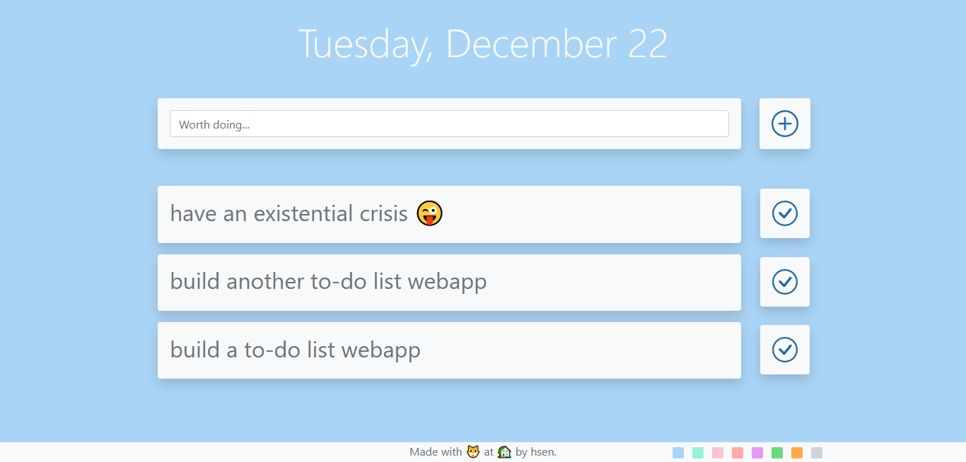
Creating a simple to-do list webapp
I've been thinking of creating something big for some time now. While such endeavors are certainly worth to be pursued, a simple to-do list webapp is the latest I came up with–sometimes you need to just build something.
Starting out with an official bootstrap boilerplate, I borrowed multiple elements from a couple other projects from mine to kick-start development. First, I structured the HTML layout without much meddling with JS. Since I aimed for a simple and elegant layout, it is no surprise a good amount of hours was spent on this task alone.
After getting the layout finished to an acceptable extent with help of CSS, I dived into the JS file that I created to contain my functions for DOM manipulation and else. Although I was determined to keep the moving parts to a minimum, I can’t really say I had a very solid picture of what I would end up with. Far from it. However, I had some vague sense of direction throughout the project, and it was almost like I was tackling each functionality I wanted to implement (which I was figuring out on the way, mostly) one after another–my approach improving (and esteem increasing) with each developed solution.
There were a lot of times I got in the zone, experiencing flow. I was frustrated more than a couple times after obsessing on tiny visual details, albeit less frequently than flow states. The process was not hard, but refreshing.
Polishing: from within and without
Once the main functionality was implemented, it was time to smooth out rough edges and increase the fluidity of UX. Tinkering with the animation speed here, setting the hues there, I even implemented an all new color palette for selecting a background color. It is true that too many choices can be demotivating1 in certain scenarios. Selecting a color for the the background of a webapp designed for simplicity should manage to not overwhelm the user with too much color choice (think the color picker). Considering that undeniable fact that the visuals were mostly designed to apt my own aesthetic tastes, the choice was obvious–go with a small set of colors that the user shall select in an equally simple manner. The transition from one color to another was also very simple, yet elegant. Finally, the flow of UI was smooth, and satisfying.
Rinsing, and repeating
The code was pushed to GitHub2, and a repository web page3 was created with GH pages. The link was passed around, and feedback gathered. A dozen good ideas, and I implemented some, hopefully being the proper authority4 for the product 😉. The updated code was pushed once again, GH Pages deployed a newer version of the repo page for me. It was all good. And that's how it should have been, could have been more present though. We grow at what we do, and of what we dream.
 Screenshot